GeoServer chart extension
Business reporting is a common need in various organisations. Most of the time, it is built upon tables and simple charts, such as pie or bar charts. Yet, sometimes, you need to add an extra dimension into it, in particular, geographic distribution. In some cases a thematic map does the job nicely, but if you need to represent the composition of a phenomena relying on more than one variable, the result ends up being hard to read.
This is where the overlay of charts and maps come into play: the idea is to overlay bar chars, or pie charts, over a polygon or point map, associating each geographic feature with its own little diagram. As surprising as it may sound, you have been able to create such maps with GeoServer since a few months ago: by putting together the dynamic symbolizers feature and the Google Charts online API, it’s already possible to nicely overlay charts of top of a map. This works great in conjuction with the KML output, where the client has to go and fetch the chart separately anyways. However, it present some limitations in the classic WMS case:
-
you are depending on an external service that’s not under your control
-
if there is any missing feature, you can just ask and hope that next release will include that feature
-
rendering the charts requires remote calls, which will slow down the map rendering significantly, at least for the first requests
An open source solution, completely embedded in GeoServer, would guarantee control over the service availability, over its features, and provide excellent performance. David Gilbert, of JFreeChart fame, must have thought the same when he developed Eastwood Charts, an open source implementation of the Google Charts API.
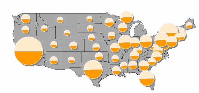
The GeoServer charting module builds on top of Eastwood charts, bridging it with the dynamic symbolizers capabilities already available, to provide fast, in process charting over the map. Let’s have a look at an example built on top of the usual topp:states demo layer. We are going to depict the distribution of male/female population in the various states using pie charts, and to make the diagram more interesting, we’ll make the pie size proportional to the total amount of people in the state. Here is how the result will look:
You can download the full style if you like, here we’ll have a look at the snippet in which the diagram is setup:
  <PointSymbolizer>
    <Graphic>
      <ExternalGraphic>
        <OnlineResource xlink:href="http://chart?cht=p&chd=t:${100 * MALE / PERSONS},${100 * FEMALE / PERSONS}&chf=bg,s,FFFFFF00" />
        <Format>application/chart</Format>
      </ExternalGraphic>
      <Size>
        <ogc:Add>
          <ogc:Literal>20</ogc:Literal>
          <ogc:Mul>
            <ogc:Div>
              <ogc:PropertyName>PERSONS</ogc:PropertyName>
              <ogc:Literal>20000000.0</ogc:Literal>
            </ogc:Div>
            <ogc:Literal>60</ogc:Literal>
          </ogc:Mul>
        </ogc:Add>
      </Size>
    </Graphic>
  </PointSymbolizer>
Let’s analyse the components of the ExternalGraphic call, which follow the rules of a Google Charts API call:
-
cht=p: the chart type is pie -
chd=t:${100 * MALE / PERSONS},${100 * FEMALE / PERSONS}: the chart data is expressed in “text” format, and in particular, the first value is the result of 100 * MALE / PERSONS, where MALE and PERSONS are two attributes of feature being rendered -
chf=bg,s,FFFFFF00: we state that the chart background fill is solid, white and… transparent. In particular, the color is expressed as RRGGBBAA, where AA is the alpha component, which controls transparency. In particular 0 is fully transparent, 255 is fully opaque
The size of the chart is controlled using the usual
We encourage you to download the chart extension and to explore its charting possibilities. You can use it with GeoServer 1.7.4, and can find out more about chart setup in the online Google Charts documentation (mind, a handful of charts and options are not supported by Eastwood, in particular, the Google-o-meter and the spider ones).
Let us know how that works for you!